Goal
To educate children on seeing the true value of people beyond their appearance.
Motivation
The society today emphasizes superficial beauty. Such values are reflected even in children who have the tendency to judge others by their looks.
Target Audience
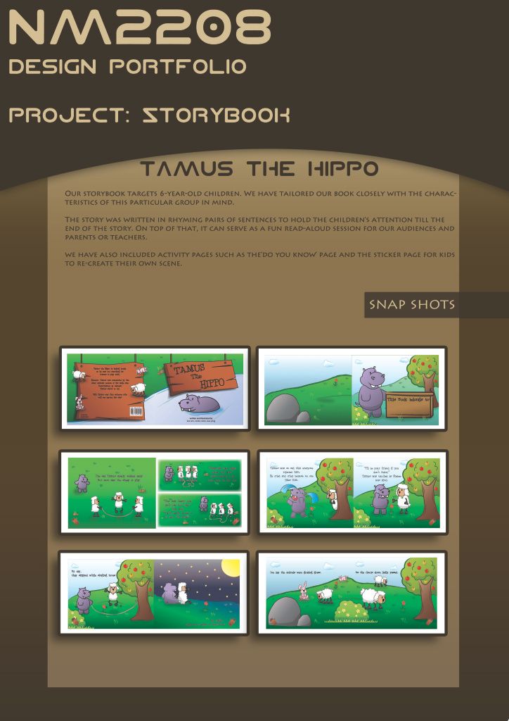
Our storybook targets 6-year-old children. We have tailored our book closely with the characteristics of this particular group in mind.
Children aged 6, in the context of Singapore, are about to enter the first level of elementary school. They are very active learners and tend to apply what they learn directly.
Hence, it is important for our book to contain positive learning objectives so that it can be inculcated as a part of their personality and character building.
OUr STORY:
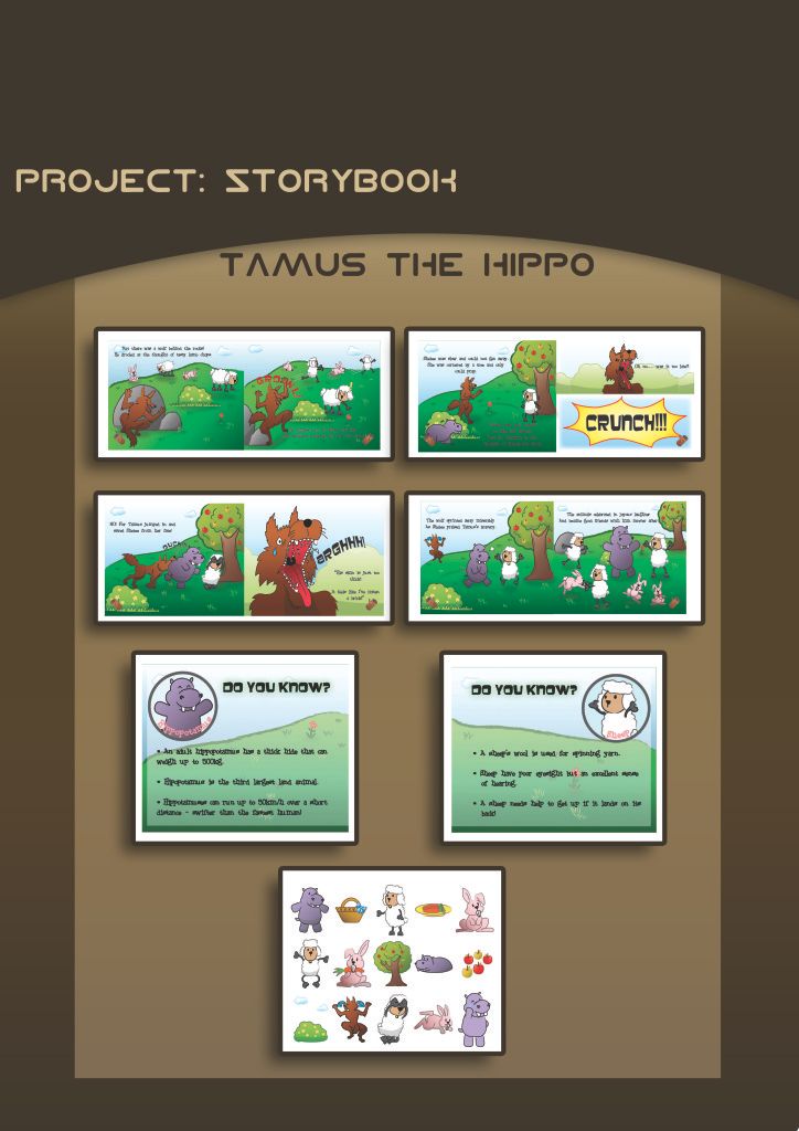
A hippopotamus wants to make some new friends and decides to approach a group of rabbits which are having picnic but was rejected because they judged that he was greedy by his size. He went on to find another group of sheep who are skipping rope but was once again rejected because they judged that he would damage their rope due to his size. The hippopotamus was very upset but one of the sheep was kind enough to befriend him. One day, while the sheep and rabbits were grazing on the plains, a big bad wolf attacks them. The hippopotamus’s friend, the sheep, was cornered by the wolf but the hippopotamus managed to thwart his evil plans. Everyone was thankful to hippo and realized that it was wrong to simply judge him by his looks.
Moral of the story: One should look past a person’s superficial looks into his/her character because that is what truly matters.
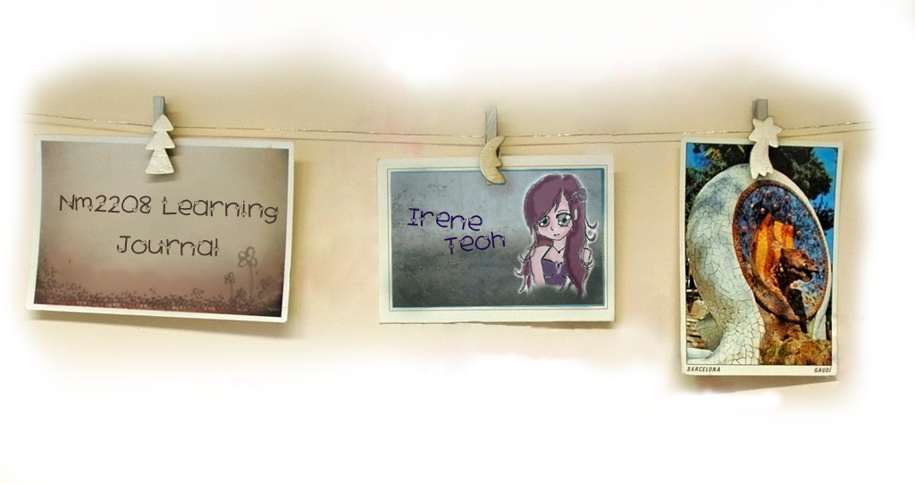
This is how our storybook looks like. (just a snapshot of it from my portfolio)
`*iRenecreations
Theme: Your no2on of colorful Asia…
(…cultural, poli2cal and social aspects
of Asia)
• Form: Postcard (both front & back)
• Size of actual artwork: A6
the notion of my postcard is to urge people to look at Asia in a different light,that is, opening up the window of facade.
Initially, this is how my initial postcard looks like.
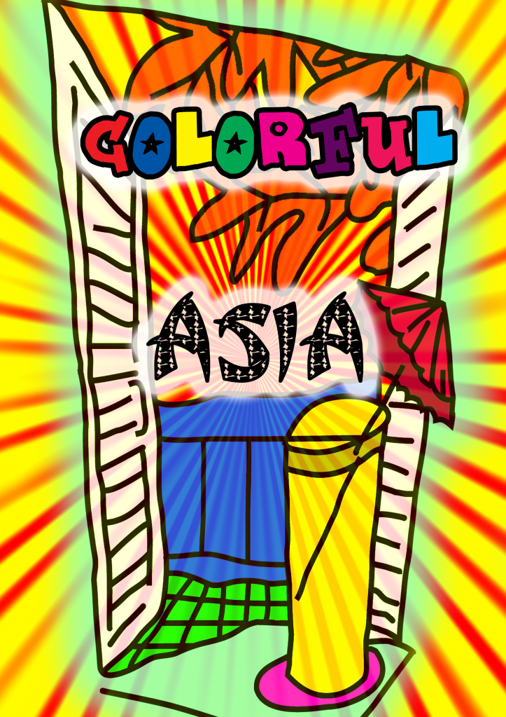
the color scheme:
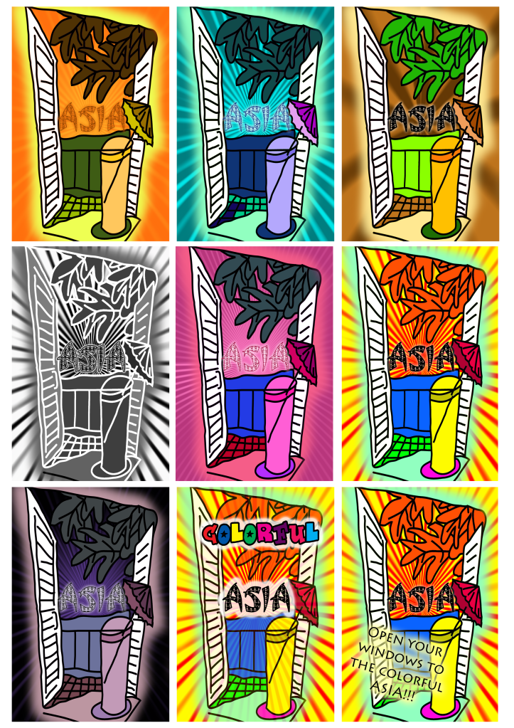
comments during tutorial:
- not so asia.
- can add more asian elements to it
- idea behind is okay
- change the high ball glass to tea cup instead
after editing and enhancement, my postcard turn into this, however with lesser color scheme.
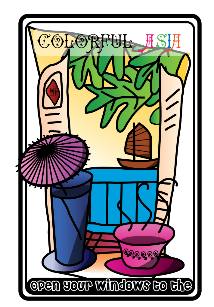
At the background, there's a vietnam sampan and on the foreground, there's a highball glass with a japanese umbrella. this portion is to show the sunny climate of most countries in Asia. on the bottom right of the picture is a china tea cup with Henna designs from India. And,there's also a chinese writing on the window. The design of the window is inspired by Indian architecture.
the color scheme:
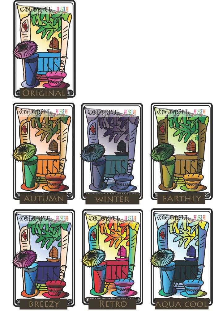
final:
with front and back. (the back should be in greyscale)
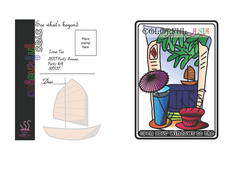
I tried to steer away from the commonly protrayed elements about asia, eg. food, clothes and building. hope you will like this postcard! =D
`*iRenecreations
my partner and i did up a few sketches!
check them out!
`*iRenecreations
POSTER Design•
Theme: Save, prevent, kill…
• Content: Poster design
• Size of actual artwork: A3
• Color: full color
•
Targeted audience:– General public
•
Location of poster:– Bus stops
– Notice boards on busy streets
The objectives for this assignment are:
– Understanding the importance of basic visual
elements and design principles in communicating
a message
– Developing necessary techniques to communicate
the message through form
– Application of basic visual elements and principles
to capture fast, passing audience
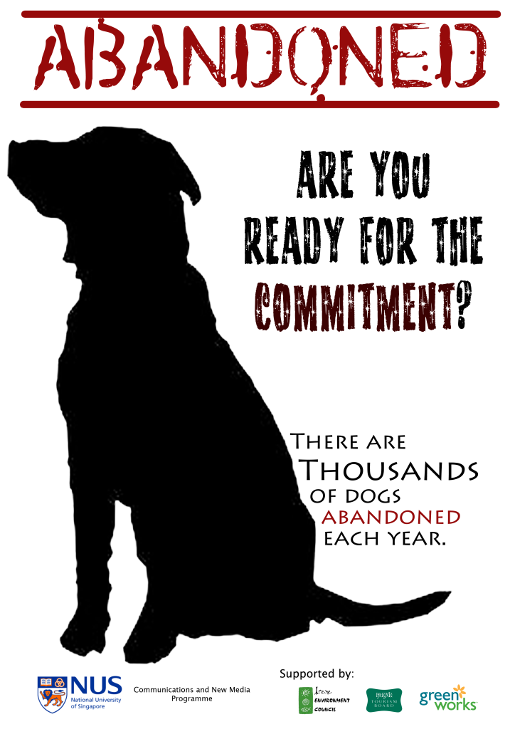
Initially i had a few ideas. then i narrow it to animals and environment.
I know that these two areas are very common. However, these areas are of utmost concern to the general public now.. Nevertheless, I had a nice picture that i took and i really want to share. Sooo....
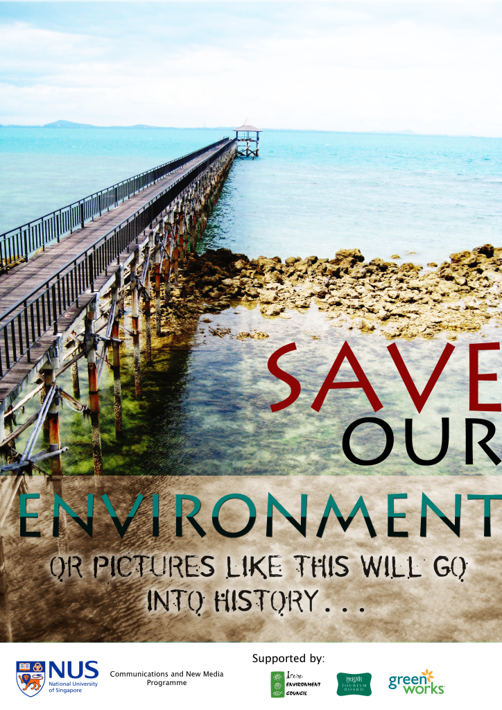
this is a picture taken when i am in batam doing some recce for the local villages schools and orphanages.
eventually, i chose the one on environment, cox the silhouette of the dog may not be that attractive. Personally i believe that beautiful pictures are able to attract busy passerbys, like me. if the picture has clear landscape lines and stuff, i will look at it. On the otherhand, busy and crowded picture definitely won't attract me. =D
comments during consultation:
- color burn overlay should be taken away.
- some letterings on it is not so clear.
After consultation, this is the final prototype.

`*iRenecreations
Visual narrative – Telling a story in 8 photos
(without using words to describe your story)
• Story telling: Your story can be with or without a twist
• Media: Photography (with or without photo manipulation via soJware)
• Equipment: Point and shoot Camera or a good handphone camera (min. 3MB)
• Size: Approx. 3R each photo.
The objectives of the assignment are:
• Understanding and constrains/ problems representation
• Using photographic techniques to communicate ideas effecively
I did two stories. Here they are!
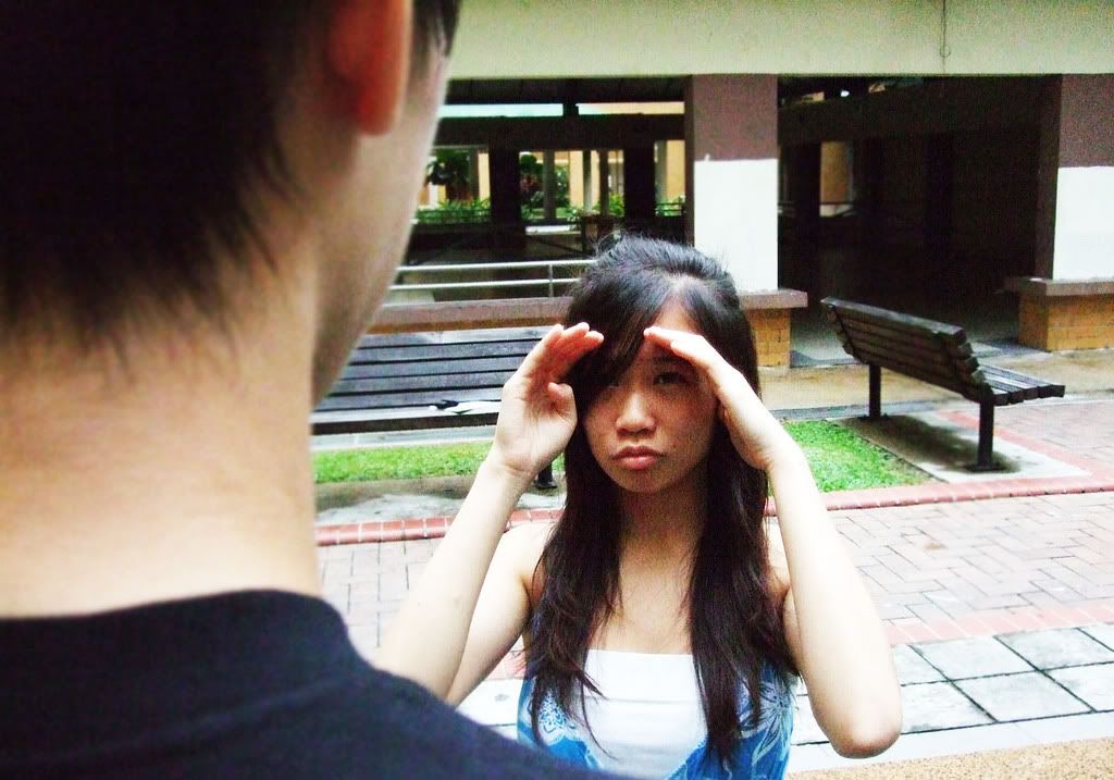
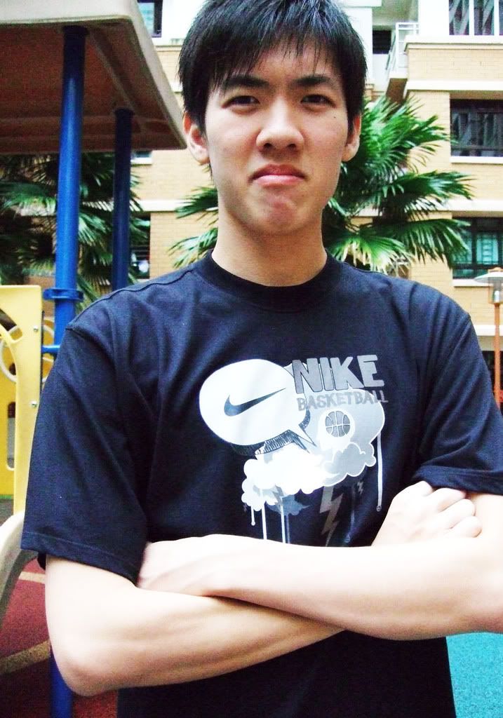
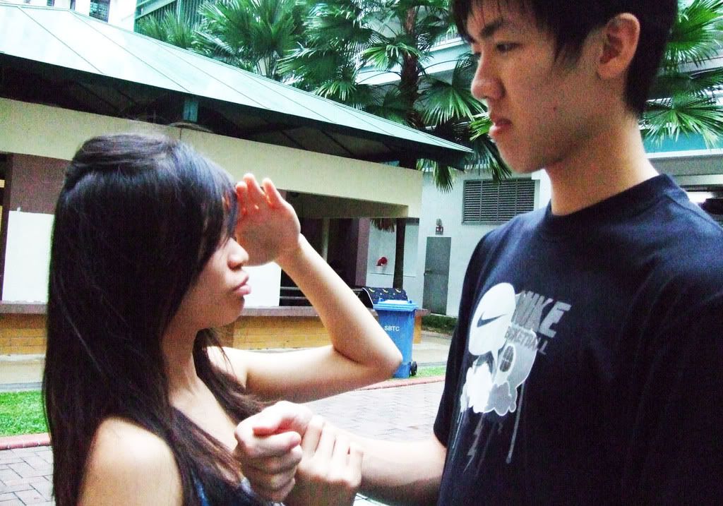
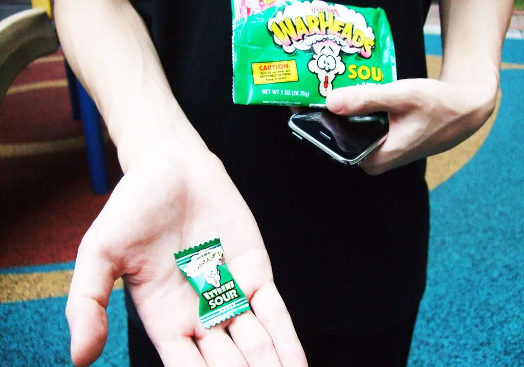
FIRSTMy Picture Story Too Little Too Latemodels: Florence and Ronald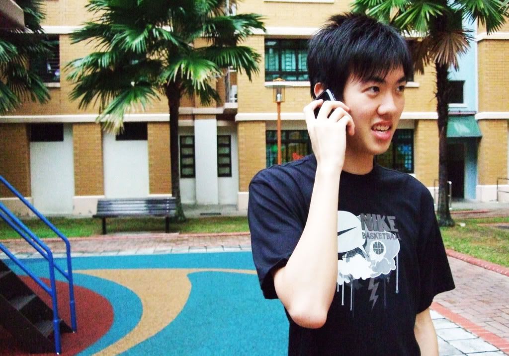
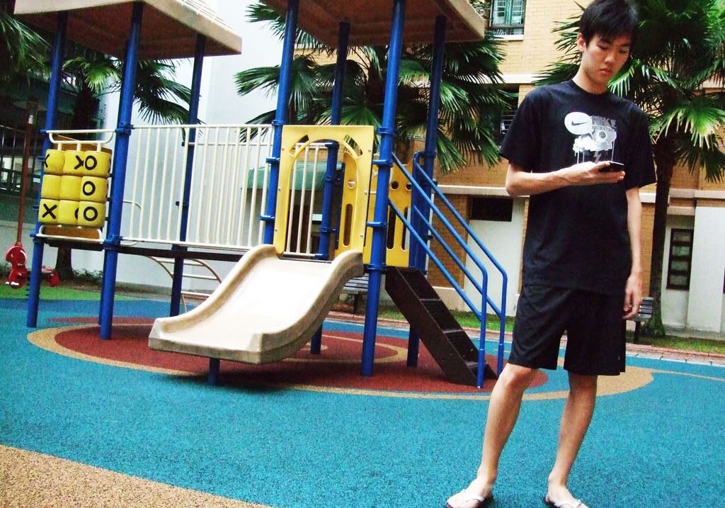
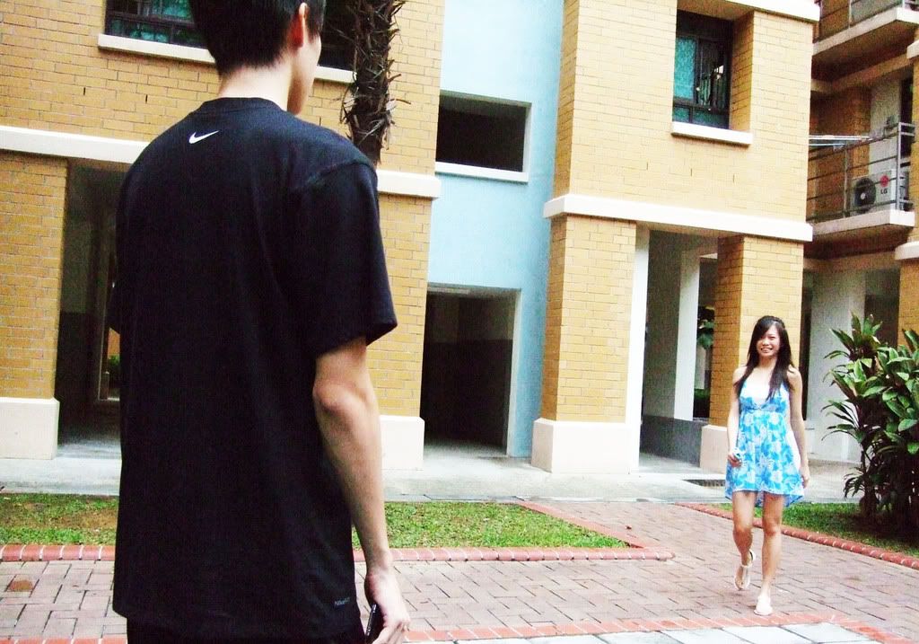
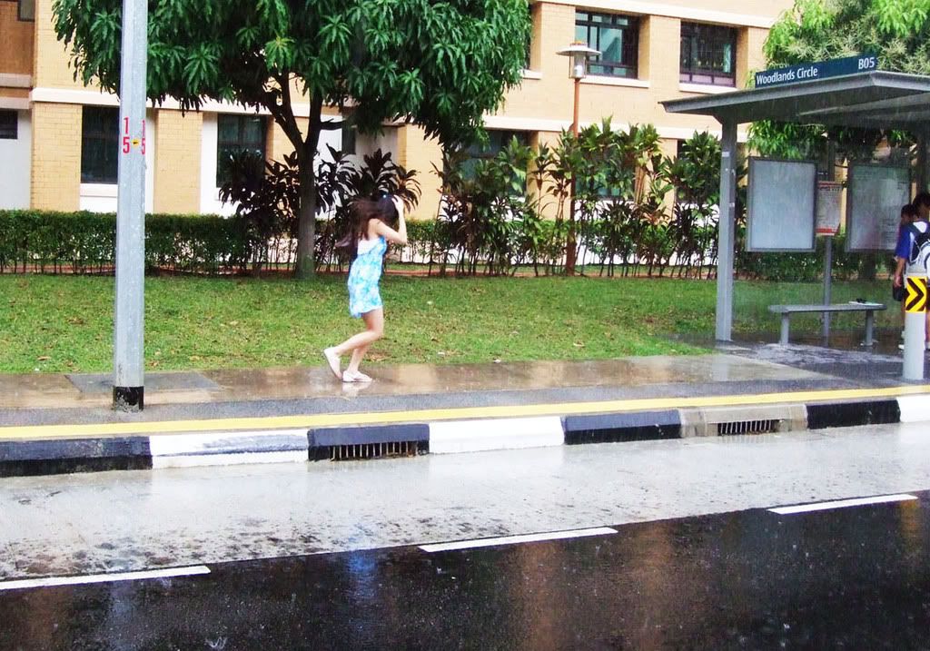
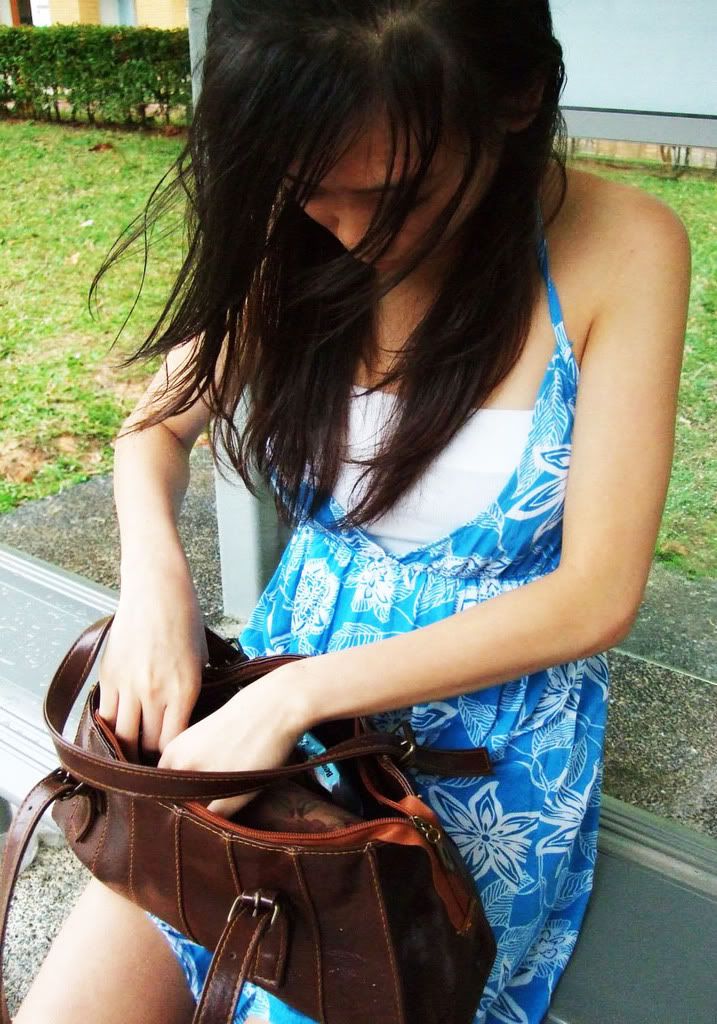
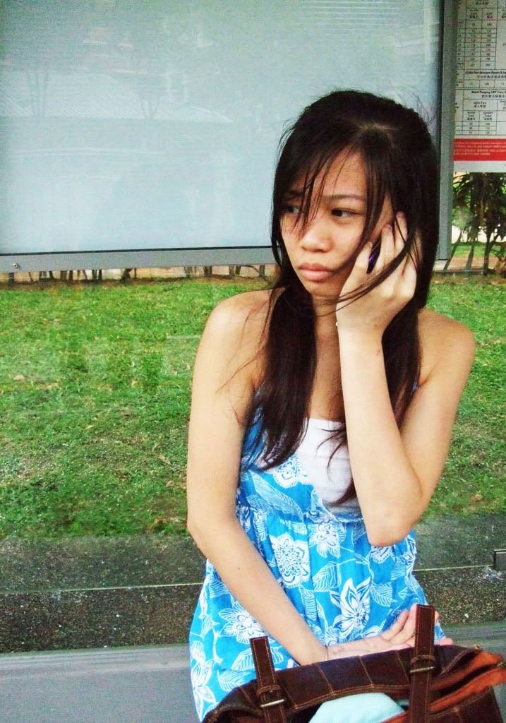
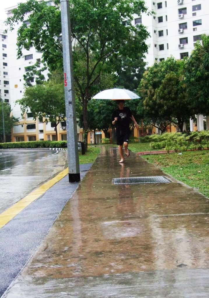
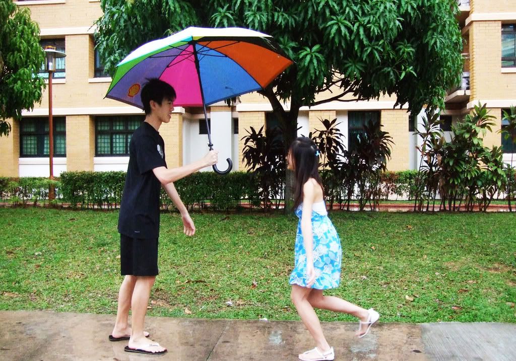
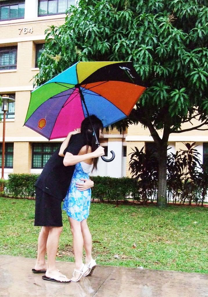
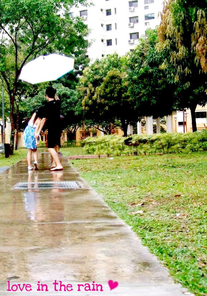
 SECONDA Picture Story (II)Love in the Rainmodels: FLorence and Ronald
Shot 1
Shot 2
Shot 3
Shot 4
Shot 5
Shot 6
Shot 7
Shot 8
understand? please comment too! =D
Eventually, after consultant and my own internal debate, i have decided to choose story 2: Love in the rain.
The first story in the following areas:
- last two pictures are unable to convey the idea of the boy is not angry (via the facial expression) instead, he is sucking on a sour sweet. (reason for his facial expression)
- the male actor's acting skills not so splendid. (though he fork out his time to help me, but you can't deny that his facial expressions are not good rite? haha! thanks anyway)
Let's look at the second story,
Though the story doesnt have a twist, i hope that the story is able to convey emotions, in this case, the subtle love between a couple.
Sometimes, it's the little things one do for another that keeps the relationship going.
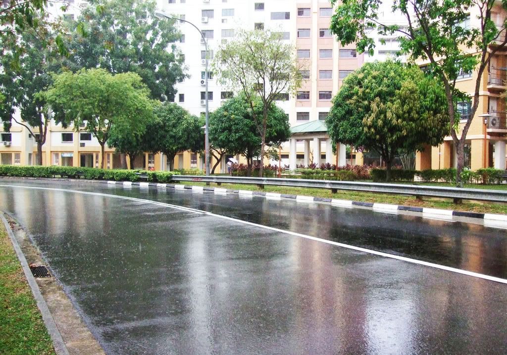
when i was brainstorming for the visual story, i was raining, so i thought that maybe i can make use of the unpredictable weather to create a story that includes natural elements. then one of my model gave me this idea. as u see, she's currently in a relationship.. sooo ya.. plenty of sweet ideas! haha!
The pictures are taken during the time when the rain is still drizzling. My models have to undergo the torture of running in the rain! really appreciate their help!
Some comments during the tutorial:
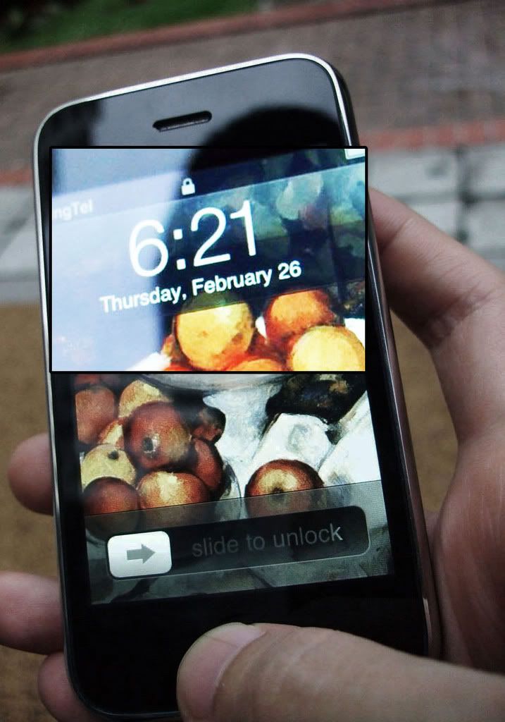
- the mobile held in hand could not be seen.
- bag disappear along the way (twist can be created here)
not much manipulation of the pictures are done here, since i have made sure that light is sufficient. I just cropped a few pic and slightly enhanced the last pic to give the lovey dovey feel.
`*iRenecreations
What is a PICTOGRAM?
A pictogram is an image created by people for the purpose of quick and clear communication without language or words, in order to draw attention to something.
Task: Create ONE pictogram for NUS communityand this pictogram will be placed within NUS campus.
My idea is taken from the Deck. It is rather common that ppl leave their bags on the seats and table to reserve their seats and off they went to buy their lunches.
This pose a great opportunity for potential thefts. Hence, I would like to create a pictogram to warn students from that danger.
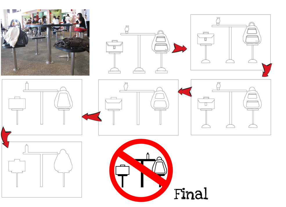
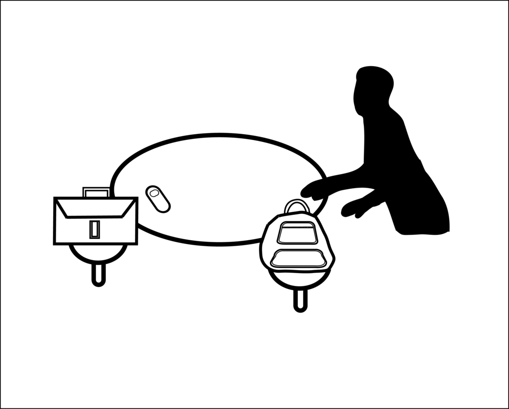
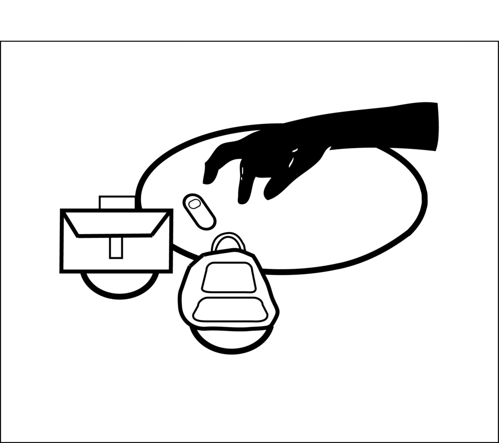
Initially, i have created a pictogram which purpose is to warn ppl against reserving the seats by putting their bags on it.
This is my 5 degree of abstraction for my first try.
 (click to enlarge)
During the tutorial, comments such as the ambiguity of the sign made me had to redo my work.
My sign can mean 'do not reserve seats' and at the same time mean 'do not leave ur belongings unattended'.
Furthermore, I was told that my last step, the abstraction level is actually not ABSTRACT enough. I merely remove the details inside and did nothing to the overall structure of the pictogram. Hence, i took the chance of recess week to re-do my work.
oh man! It took me whole lot of time! Goodness!
My second try:
I will re-take the realistic photo again.
STEP 1: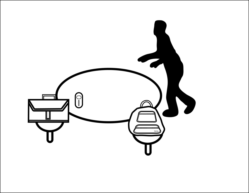 STEP 2:
 STEP 3:
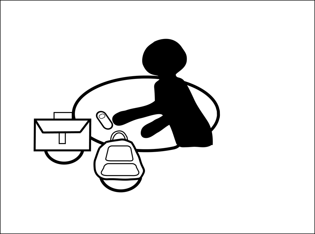 STEP 4:
 STEP 5:
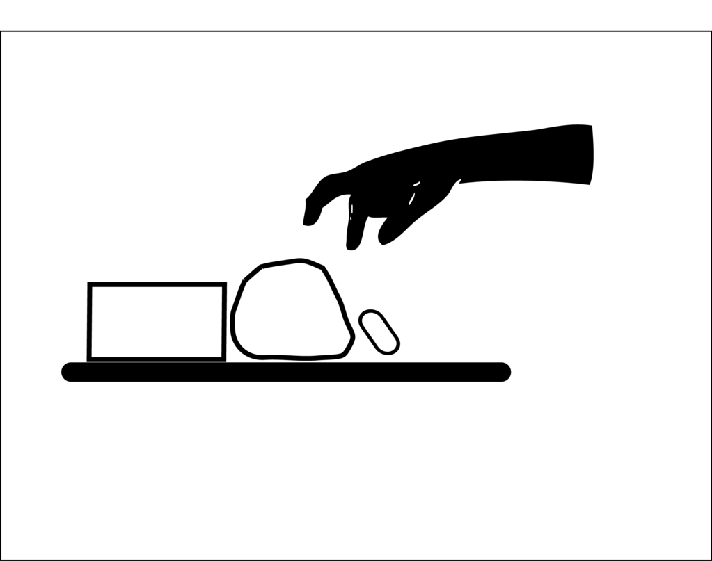
I may consider refining my final pictogram to make it even more abstract. For example, changing the hand into a stick hand or sth along that line.
Eventually, I decided to choose the last second one to develop into my final prototype.
FINAL DRAFT:
I was thinking of putting 'CAUTION!', thinking that it might create a clearer visual communication. My friend suggested that 'BEWARE!' may work better and hence my final.
FINAL: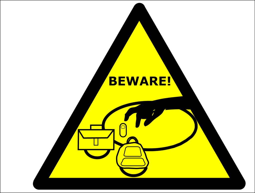
Is my pictogram too detailed? My bags have too many details is it?
I wonder... comments please. =D
`*iRenecreations
Hey! Finally change my banner to a nicer one alr. The current one is the new one.
Looks okay?
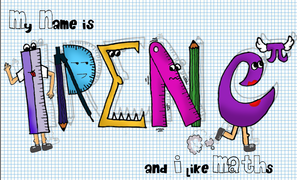
okay. Back to my first assignment, Me, Myself and I.
I have brought my final piece of artwork to class and critiques were given.
Not many changes need to be done. In the beginning, i had difficulties forming my 'N' and 'E' with mathematical instruments. Finally, my brain is cracked and i got exponential to help me. phew~
Basically my name is clear and it is able to communicate to viewers that i LoVE maths! Great!
This is my last draft.
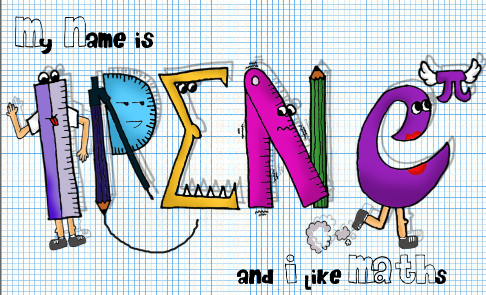
Someone in the class suggested that i should remove the circle.
Here it is - My FINAL!
 (click to enlarge)
Thank you for all of your comments. Keep them coming! =D
`*iRenecreations